Monday, April 23, 2012

Final Artist Post


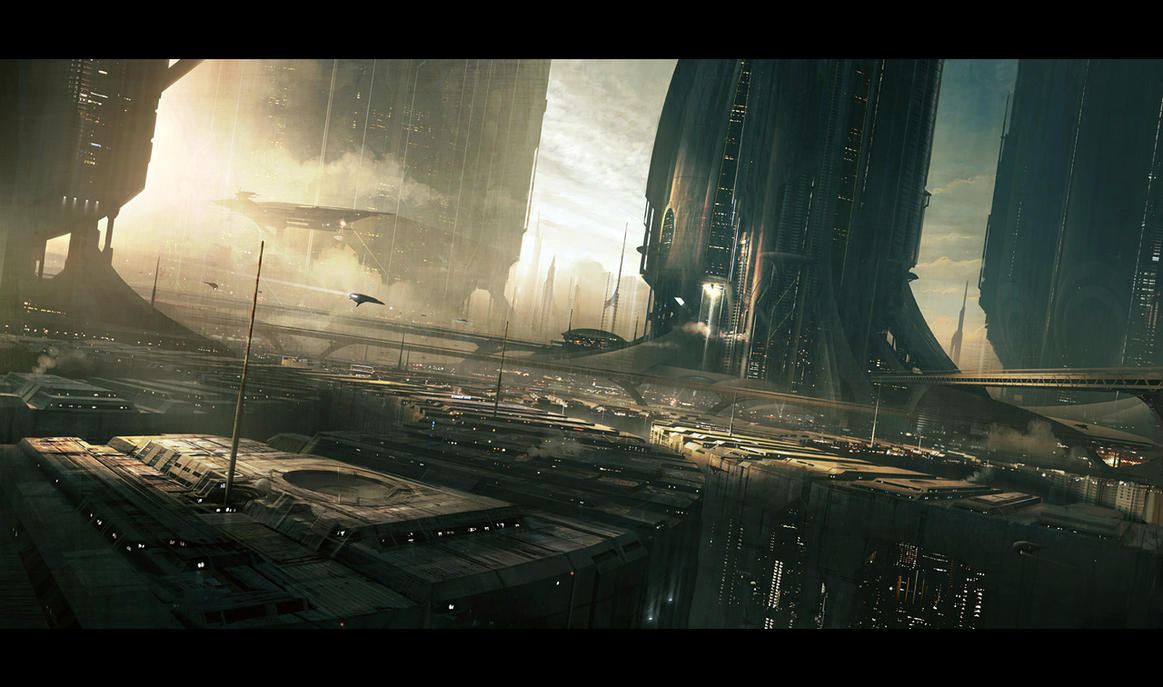
Above are images that were digital drawn using Adobe Photoshop. The artist responsible for these drawings is named Andree Wallin. Andree Wallin is one of the artists that I have become to enjoy viewing. I have found out that digital artists do what is called speed drawing, which is where over a period of about four hours they try as hard as they can to turn out a polished piece of work. Andree Wallin has done many of these. He has an extensive portfolio and background working with some premier companies on some big projects.

He has worked with Universal pictures on a project called Oblivion that they are making into a fully featured film. He has worked with a company called Digital Domain to help create the concept art for the cinematic trailer for Halo 4. He has an extensive background working on projects like these and is a very creative individual with a ton of talent. He started doing commissioned digital artwork in 2006 and was able to turn it into a professional career in 2008. Andree Wallin is 28 years old and lives in Sweden.

Wednesday, April 11, 2012

Carin Reich

Above is a website called The Kitchen. This website was made by a web designed named Carin Reich. It was honestly hard for me to pick one web designer as my favorite because there are so many different unique takes to making a website that I have found. So many designs I have discovered are great but yes there are also a good amount that are pretty awful.

The key to developing and designing a good website is sticking to the principle of keeping it simple. I think less is often more when it comes to websites. Above is a website about a kitchen community being united by a bistro that provides a melting pot of foods between the communities different tastes. One thing that I have noticed about my behavior when I look at a website for the first time is the pictures and I realize that websites like the one above does a great job of drawing you in because of the kind of atmosphere the pictures suggest. To look more specifically at the design you can see that there are not a lot of links everywhere. Its very simple and out of the way so the user can engage in that kind of atmosphere that the picture gives the user. When people go to websites they want to get the feeling that they are already there. They want that feeling and they don't want to be confused with clutter. Being straight forward in the website business is a good strategy to have.

All in all there are many different ways to approach designing a website. Often times designing a website relies heavily on what the customer wants, and what kind of profession the customer has. If the customer wants to launch a website that lists  products for people to buy then something like that can really kind of limit your creativity as a creator. It's important to note that outside forces can dictate what you are able to do as a designer.

Friday, March 16, 2012

Text Drawing


Above is a a text image I made in Illustrator using the envelope wrap feature. It took me a very long time to get this just right because I don't understand the algorithm it uses to wrap the text around a specific object so that led to weird looking text wrappings. I had to break most of the image down into little segments and then apply the text wrapping. I am happy with the way it turned out though. I started with a picture of Albert Pujols hitting the ball and just went from there. I think it looks pretty cool. I think I could do a better one if I focused on it specifically.

Monday, February 27, 2012

Logo Modification


Above is the original Burger King logo. 


Above is my modification to the logo. 


I made this modification because less is definitely more when it comes to logos. Everybody who eats fast food knows the Burger King logo. I figured it would be best to simplify it down to the letters B and K because everyone knows what that stands for when they look at it. There is no need to spell out Burger King in your logo then have the name printed our also. If you look at many Burger Kings and the signs displaying their restaurant you will notice that they do this. Best way is to keep it simple with the logo. 

Monday, February 20, 2012

Logos

Above is a logo for the car company Lamborghini. Here is the URL for the above picture: https://blogger.googleusercontent.com/img/b/R29vZ2xl/AVvXsEgz_THVGemetRopV6wTX8Csxv9DGZuWNYEgsQVgJ4p60na1S8ww33GG-hoaopSGJiEwK76RrNhnGyzVFaQGJA-1p7PicNMJeOIYnANLr63LfwTEZsrfpM0aclsyVrGd2Lgcbch9pUXJlyWo/s400/lamborghini_logo.jpg
Above is a logo for the popular social media platform called Twitter. Here is the URL for the above picture: http://publishingperspectives.com/wp-content/uploads/2011/08/twitter_newbird_boxed_blueonwhite.png
Above is a logo that needs no introduction. You see the arch, you know its McDonald's. Here is the URL for the above picture: http://www.chicagoexecutivesummit.com/images/Arch%20Logo.png

Above is also a logo that needs no introduction. Here is the URL for the above picture: http://www.famouslogos.org/logos/nike-logo.jpg


Monday, February 6, 2012

Image Restoration


This image I grabbed off of a simple Google image search for poor quality pictures. This is a picture some person took of this classy dressed man on the train. One thing I have noticed with images like these is that the primary problem is that one color comes through way more than the other. In this particular case there was a tremendous amount of blue that was coming through the picture. However, I was able to bring the true colors out in the image by just adding a good bit of red into the image and playing other image adjustment tools.